Designing a Data Dashboard to advance upward mobility
in partnership with Urban Institute
PROJECT BACKGROUND
Many local leaders want to help their residents move out of poverty, but lack the information they need to reach this goal. As part of their Upward Mobility Initiative, Urban Institute sought to equip local leaders and changemakers with data and support tools to improve upward mobility from poverty and address barriers to racial equity in their communities.
While Urban had an existing website that featured data tables for every U.S. county and over 480 U.S. cities, they recognized an opportunity to make the data more engaging and accessible to a broader range of constituents.
We partnered with Urban to design the Upward Mobility Data Dashboard, through a co-creative process with a range of local leaders across a spectrum of data literacy — or the ability to read, understand, and work with data. This human-centered process ensured the tool was inclusive, engaging, and accessible.
MY ROLE
This project was completed as part of my work at Greater Good Studio. I served as Strategy & Design Lead, and worked closely with an internal team including an Operations Lead, 2 researchers and 2 designers. I also collaborated with external team members including data visualization designers and development partners to deliver the designs.
Design Deliverables
We created new designs for a data dashboard that launched in fall of 2024. More specifically, our final screen designs included specifications for overall structure of the data dashboard, user interactions across various types of data, and the visual styling of the pages and components for different devices. The data visualizations were provided by Urban’s data visualization team. These designs were presented and reviewed with the Urban team and their development partner to support a fluid hand-off between design and development teams.
SELECTED DASHBOARD DESIGNS
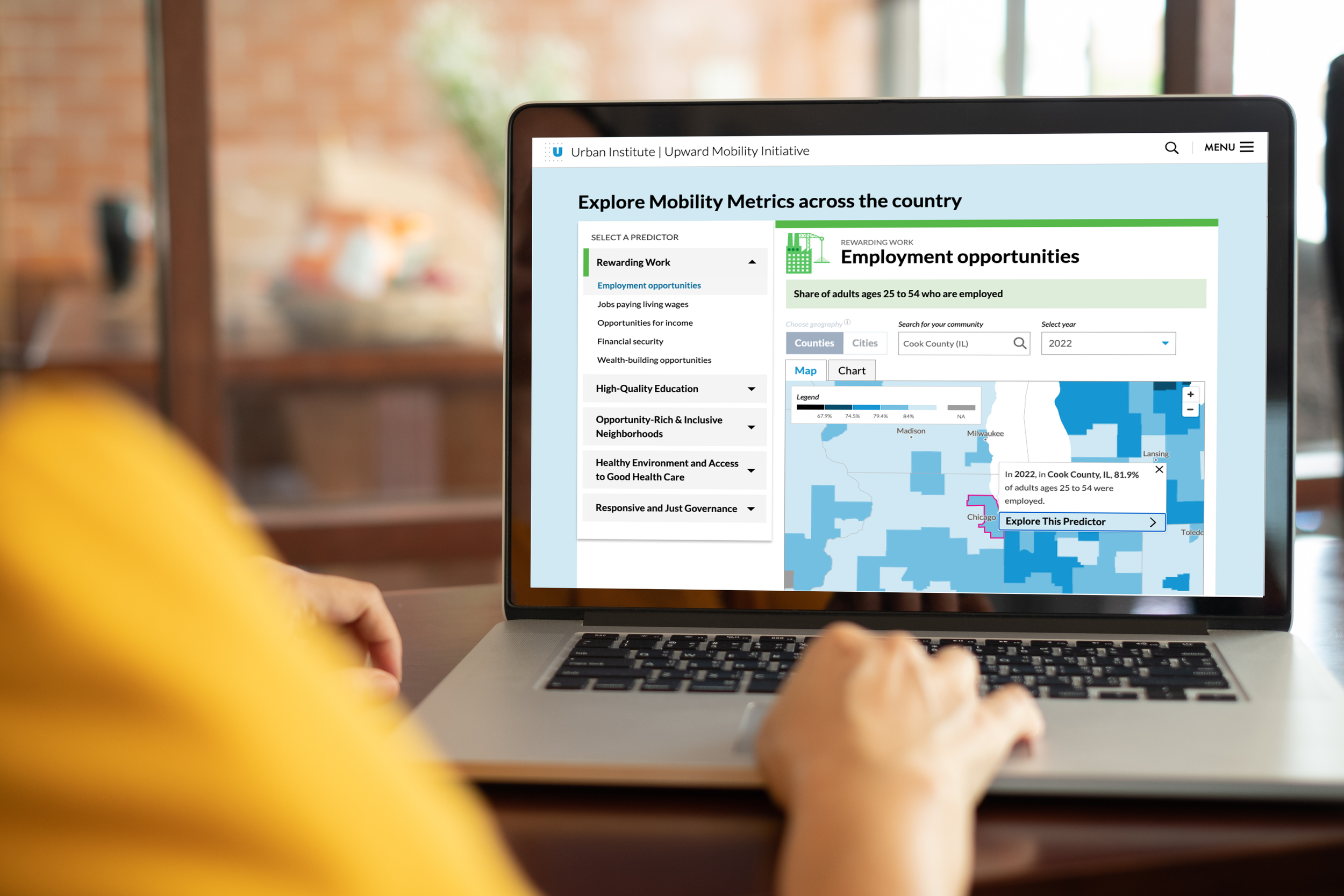
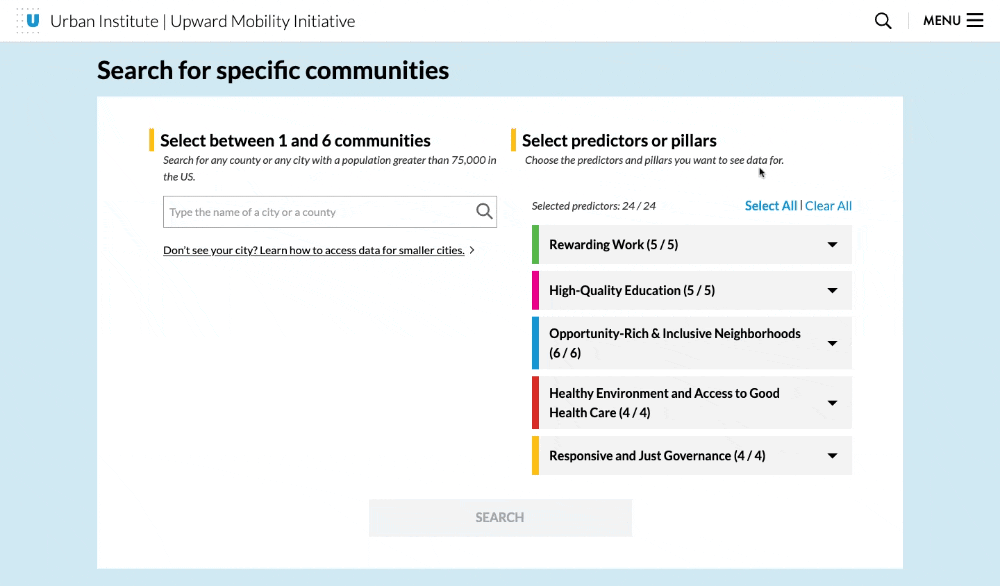
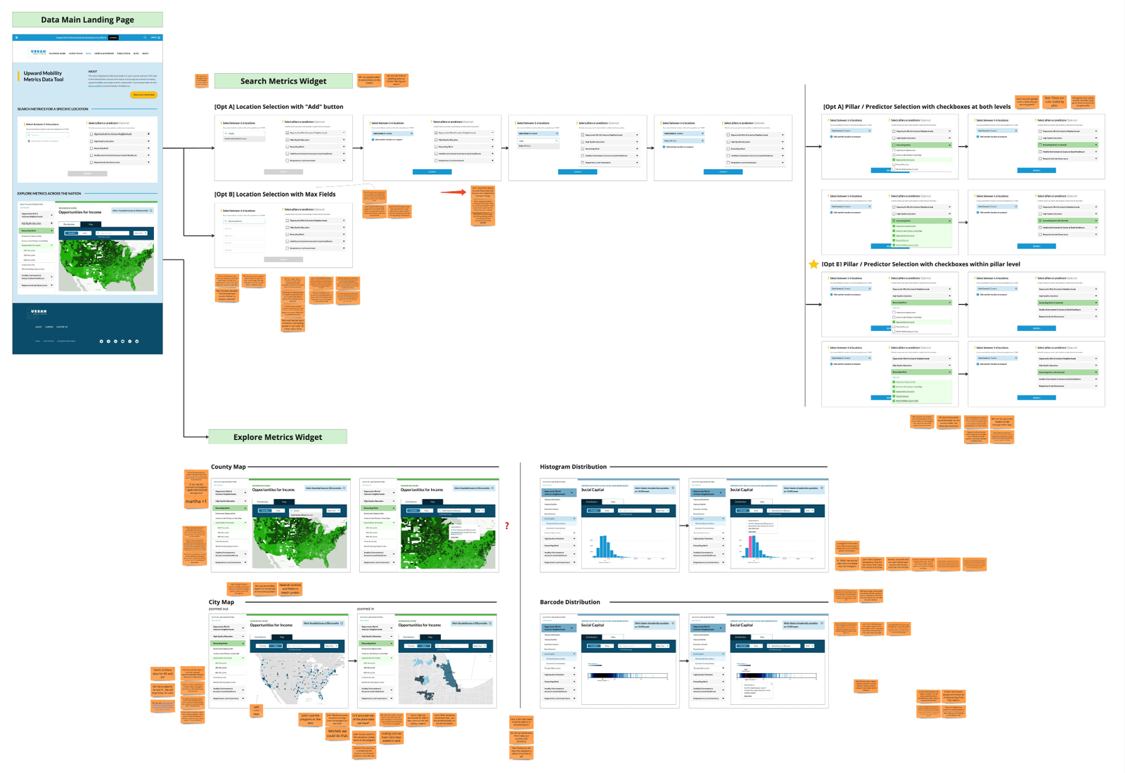
The landing page of the data dashboard provides grounding context and an orientation tour, and features two entry points into the data: search or explore. A more robust search functionality enables users to select multiple communities for direct comparison and to customize the pillars or predictors based on their interests and needs.
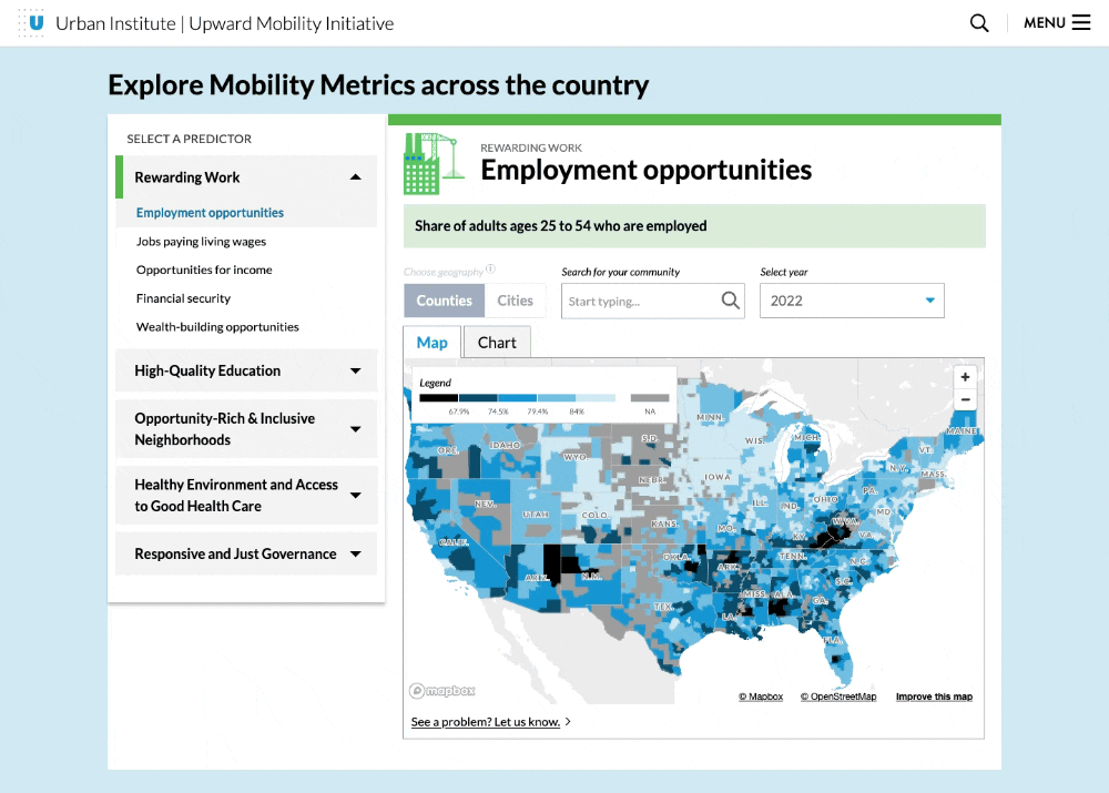
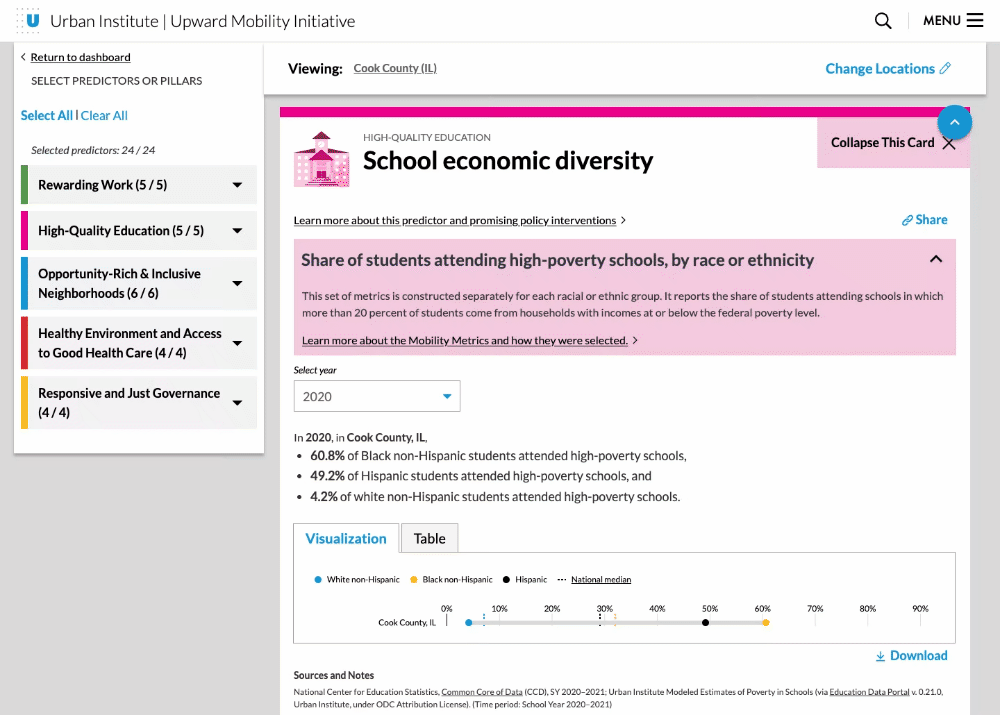
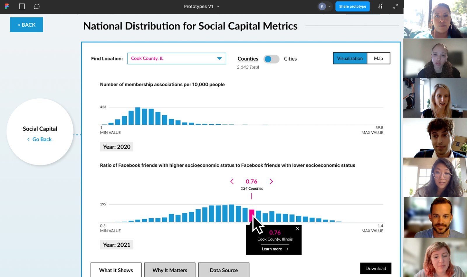
Users can also explore country-wide data for a chosen Mobility Metric via dynamic maps and distribution charts. From there, they can dive into a single location and see more details in interactive data cards.
The interactive data cards present a snapshot of the community’s data, and also allow people to expand the card to view data in different visual formats, in specific years or over time, and examine differences across racial and ethnic groups, age ranges and gender identities to understand how predictors affect different populations.
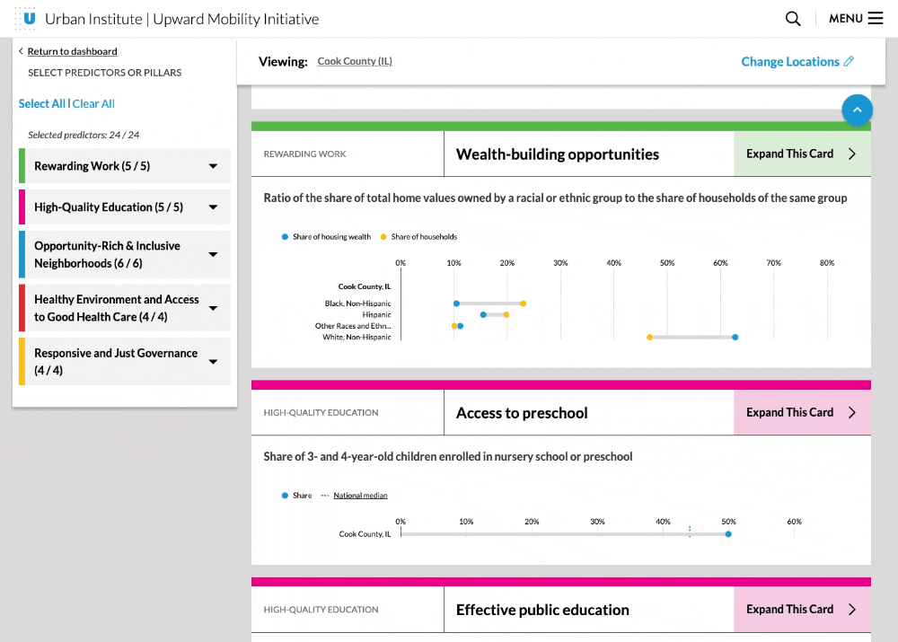
Users can change or add up to 6 communities for comparison across all metrics, and can also receive suggestions for peers they might want to compare themselves to using the Suggested Peers feature. Peer community suggestions are determined using data on demographics, housing, population, and geographic proximity to calculate an overall measure of similarity between two cities or two counties.
Users also have the ability to download datasets and the dashboard’s charts for use in other platforms and materials. They can also share links to specific data cards with community members and colleagues.
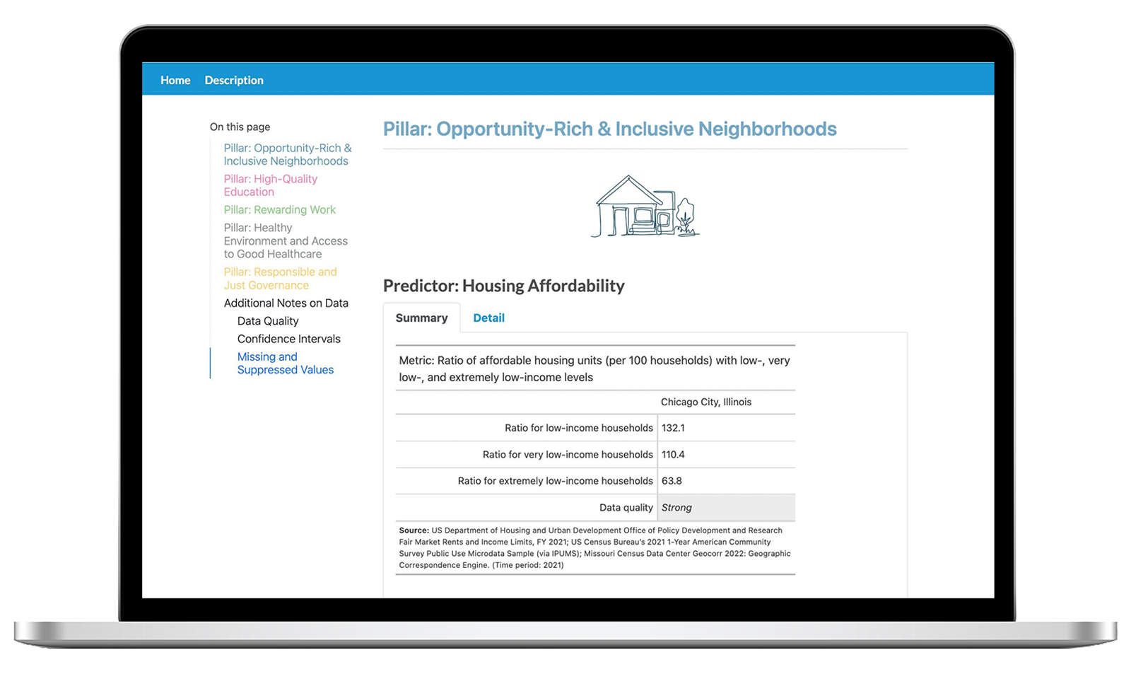
To encourage informed action and deeper understanding, the dashboard directs people to helpful guides for making sense and use of the Mobility Metrics, examples of promising local policy interventions, and supporting evidence and source material for each metric.
Process Overview
-
![]()
We started by steeping ourselves in the data and background information provided by Urban. This include the Mobility Metrics for 24 predictors associated with the Upward Mobility Framework and a concept brief created by the Urban team and their advisory committee.
-
![]()
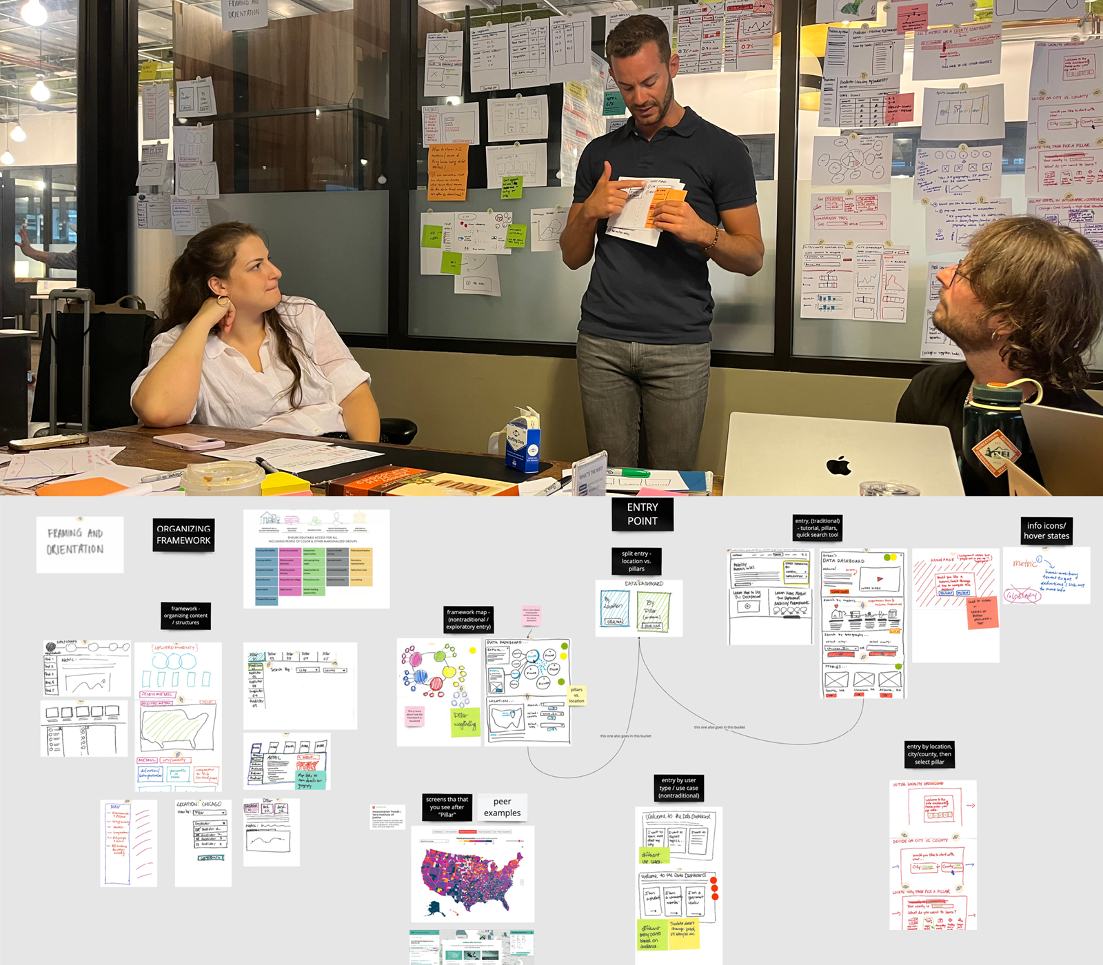
We facilitated user experience (UX) sketching sessions, working side by side with several members of the Urban team. Together we dove deeper into the constraints of the data set, and sketched ideas for potential website features, user pathways, and information architectures that would organize the website.
-
![]()
We created an initial set of website designs and conducted a design review with the extended Urban team. They provided technical and data-related feedback that helped us to prioritize concepts to be shared with end-users for their feedback.
-
![]()
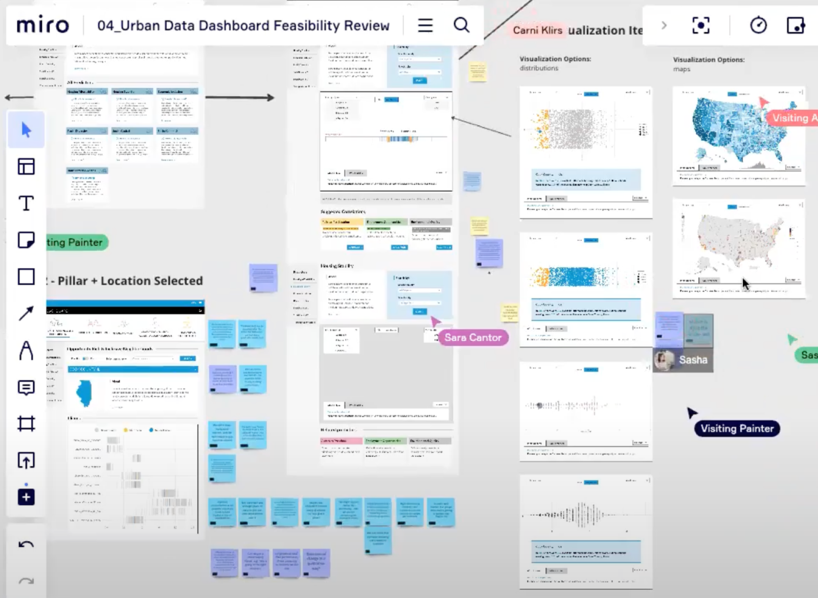
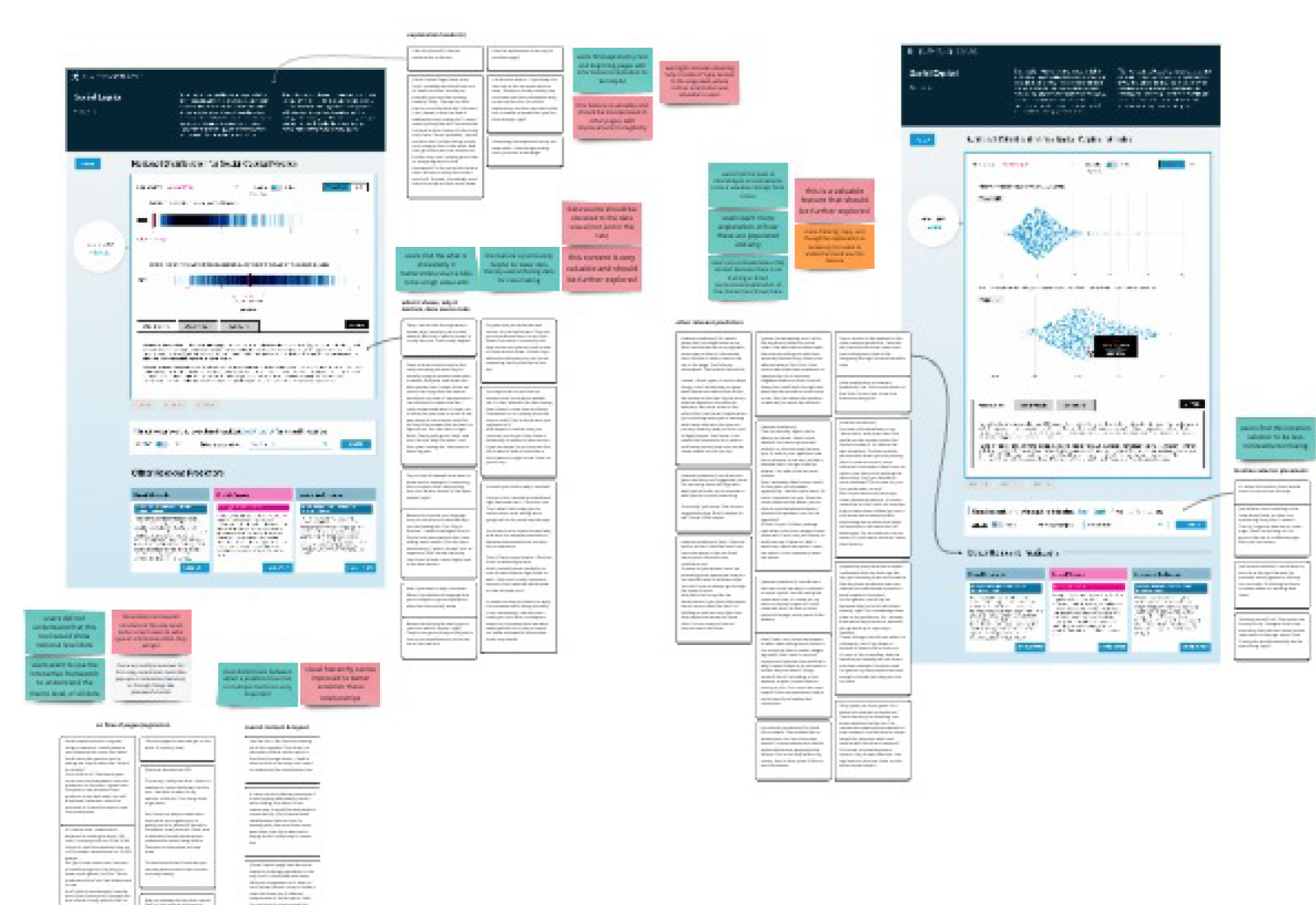
We conducted a series of prototype feedback sessions with 15 local leaders, exploring the potential user pathways and data visualization forms. We sought to better understand the value of a data dashboard, which features and functions were most valuable, and which data visualizations were most helpful in understanding the mobility metrics.
-
![]()
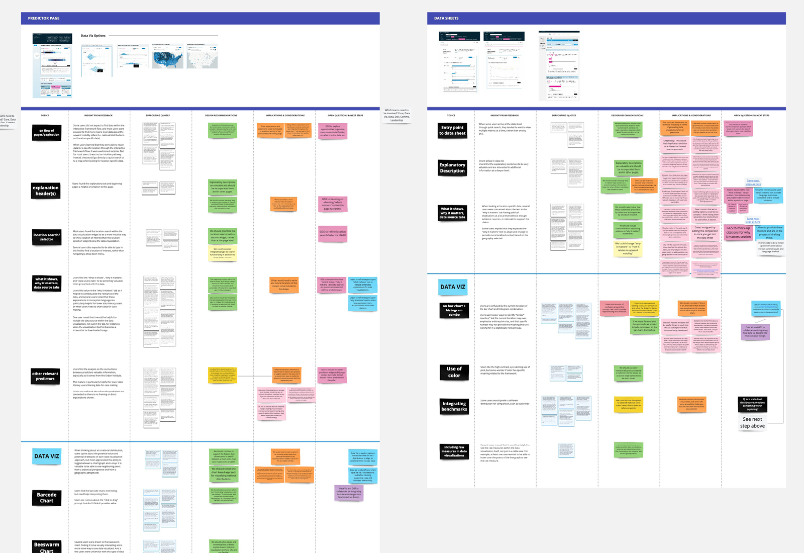
We gathered volumes of helpful user feedback. In fact, we had over 2,500 data points, which were distilled into insights about the data dashboards unique value proposition, various use cases, and content strategy, as well as recommendations for the UX/UI design and data visualization.
-
![]()
As our next step, we held a Design Alignment Workshop. We reviewed design insights and recommendations with the extended Urban team and their development partner. We also discussed implementation implications and facilitated the teams’ alignment on the design direction.
-
![]()
Lastly, we refined and finalized the dashboard designs based on feedback from two successive critique sessions with an extended Urban team and their development partner.
Client Testimonials
-

“I’m always impressed with how Kyle leads this work. He is so clear, thoughtful, and responsive. It’s a gift to manage conversations between groups with differing emphases — across tech, graphics, communication, policy, and research — with everyone feeling heard."
— Bill Pitkin, Senior Policy Fellow at Urban Institute
-

"The thoughtfulness of this process helped to bring together the expertise of different teams at Urban to work together and see things differently. And in the end, we feel it improved our process and the ultimate product."
— Samantha Fu, Senior Policy Associate at Urban Institute
-

"We’ve been getting so much excitement and demand for upward mobility work since the launch event for the data dashboard, which had more than 1,700 people! The momentum has been really strong."
— Keith Fudge, Upward Mobility Initiative Project Director at Urban Institute
Selected Projects
-
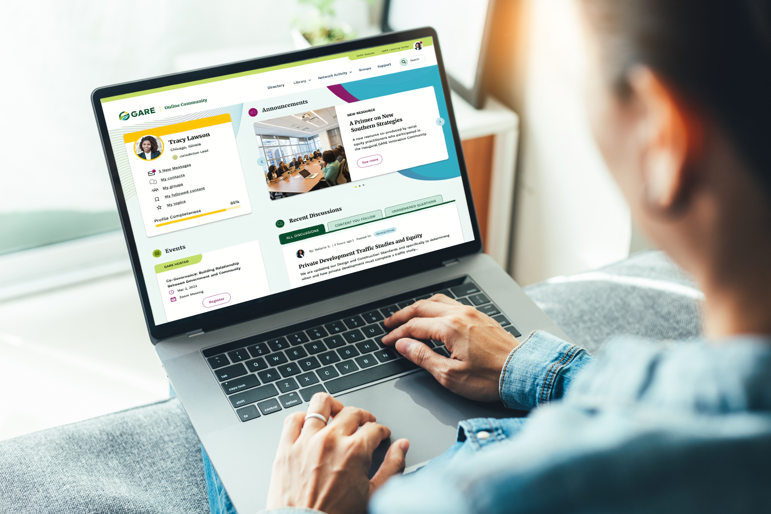
Redesigning an online community and website for racial equity leaders in government
with Government Alliance on Race and Equity (GARE)
-
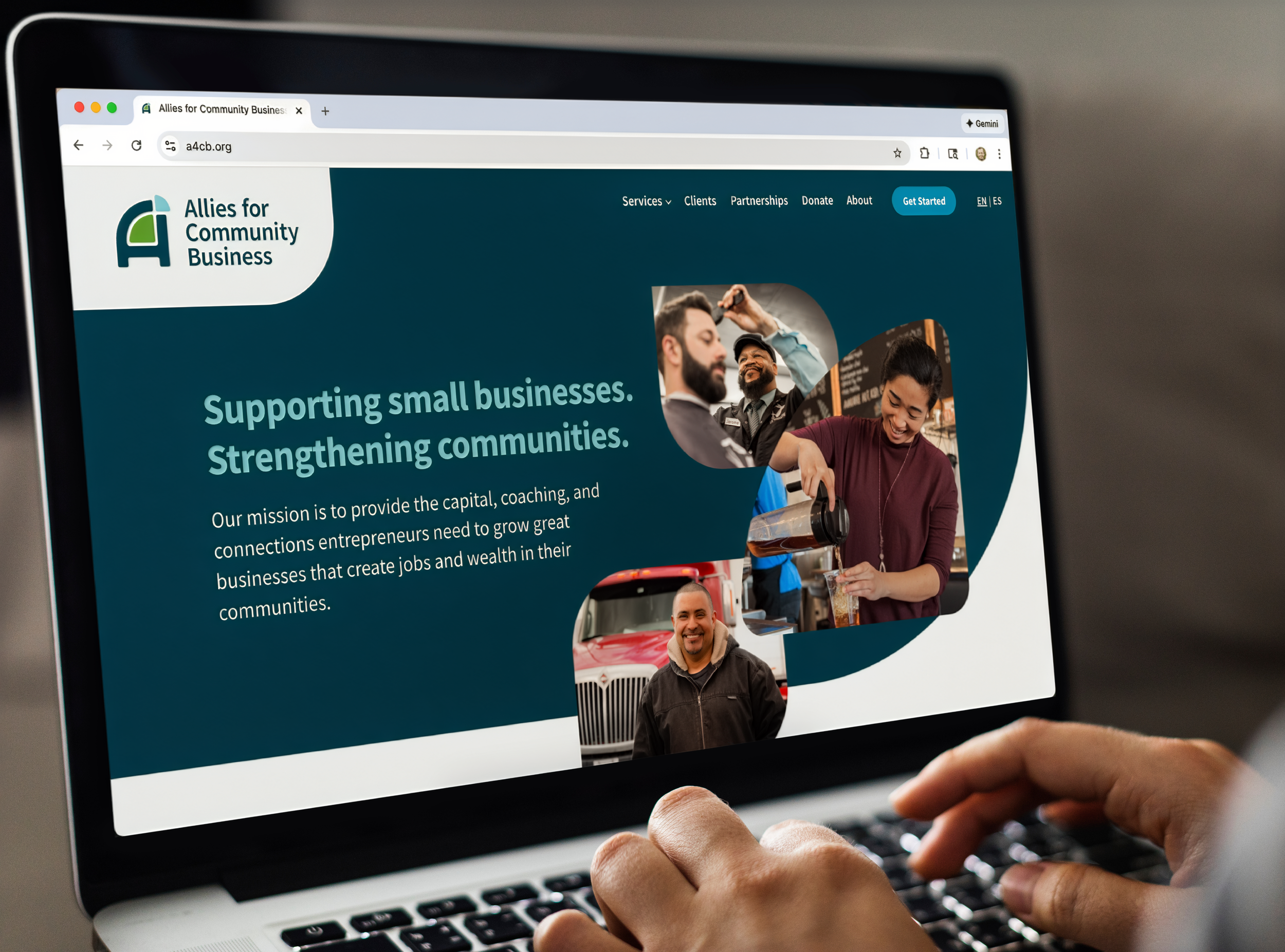
Creating a new identity for a leader in local business lending and coaching
with Allies for Community Business